Dr. Squatch
Identity
Brand
Packaging
Illustration
In collaboration with Interact Brands
How to preserve Dr. Squatch’s rugged charm and celebrate its grassroots brand while amping up its packaging system to dominate on shelf
Acquired by Unilever in 2025

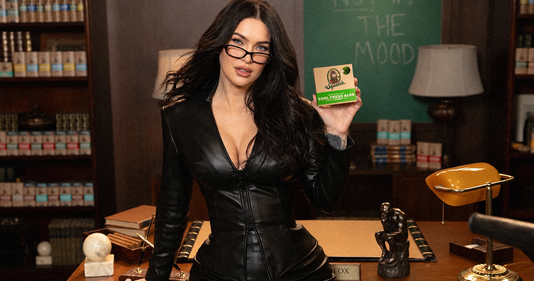
Dr. Squatch’s lovable mug had become synonymous with high-quality, cold-processed soap—handmade and shipped directly to customers. Its made-from-scratch charm felt authentic in a way that connected with end users, almost as if the CEO, Jack, was one of us.
Intending to preserve charm while building on the brand’s heritage, I redesigned the Dr. Squatch logo to retain the same Squatch everyone knows and loves, while refining it into a more versatile and functional identity system.
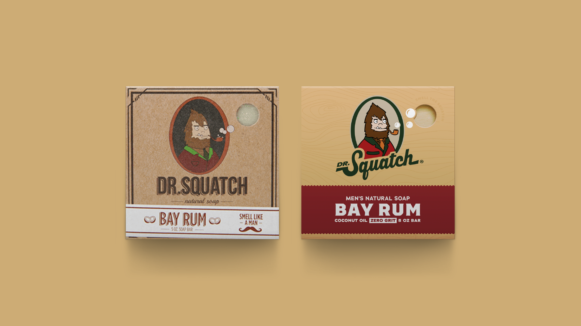
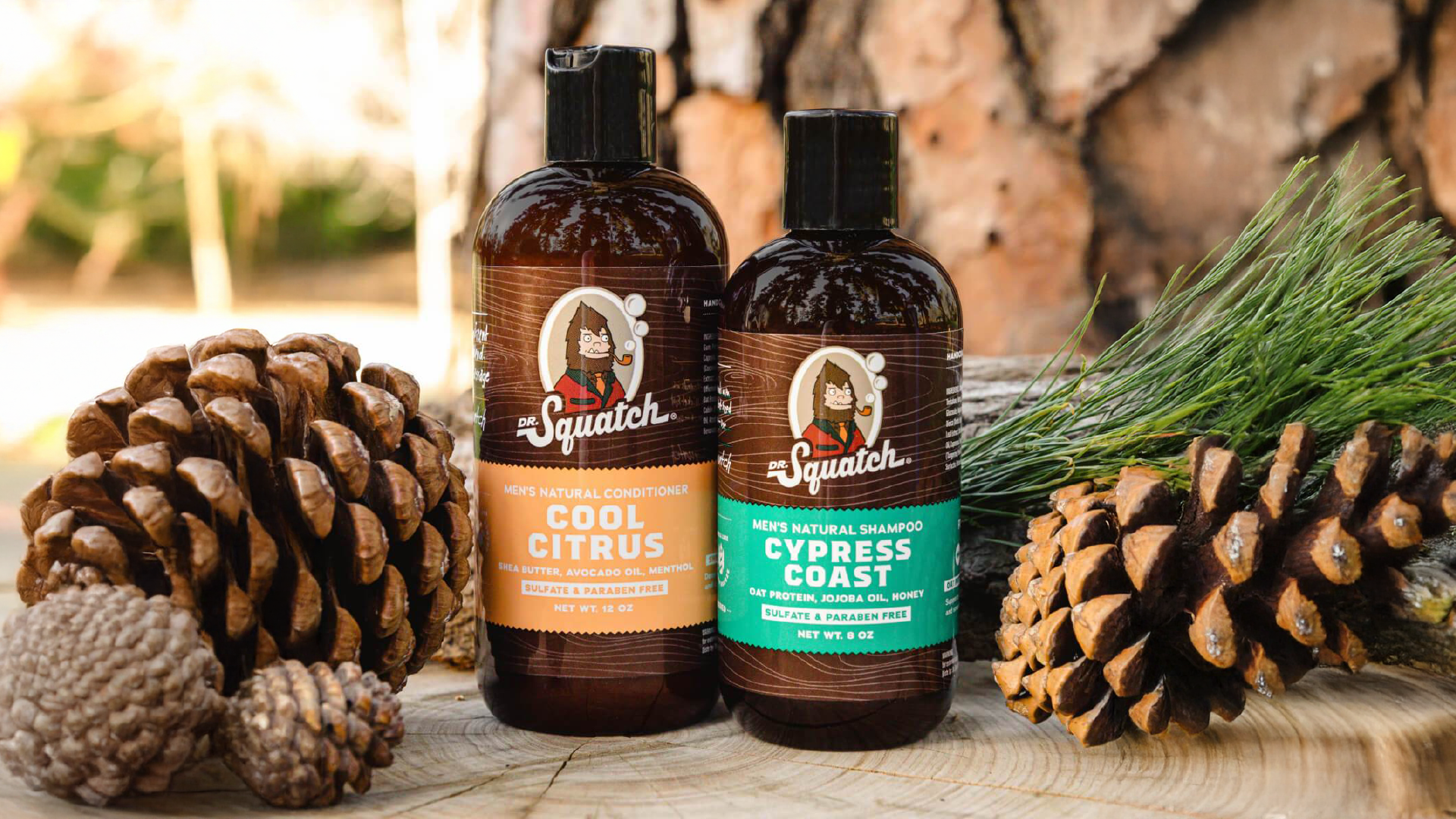
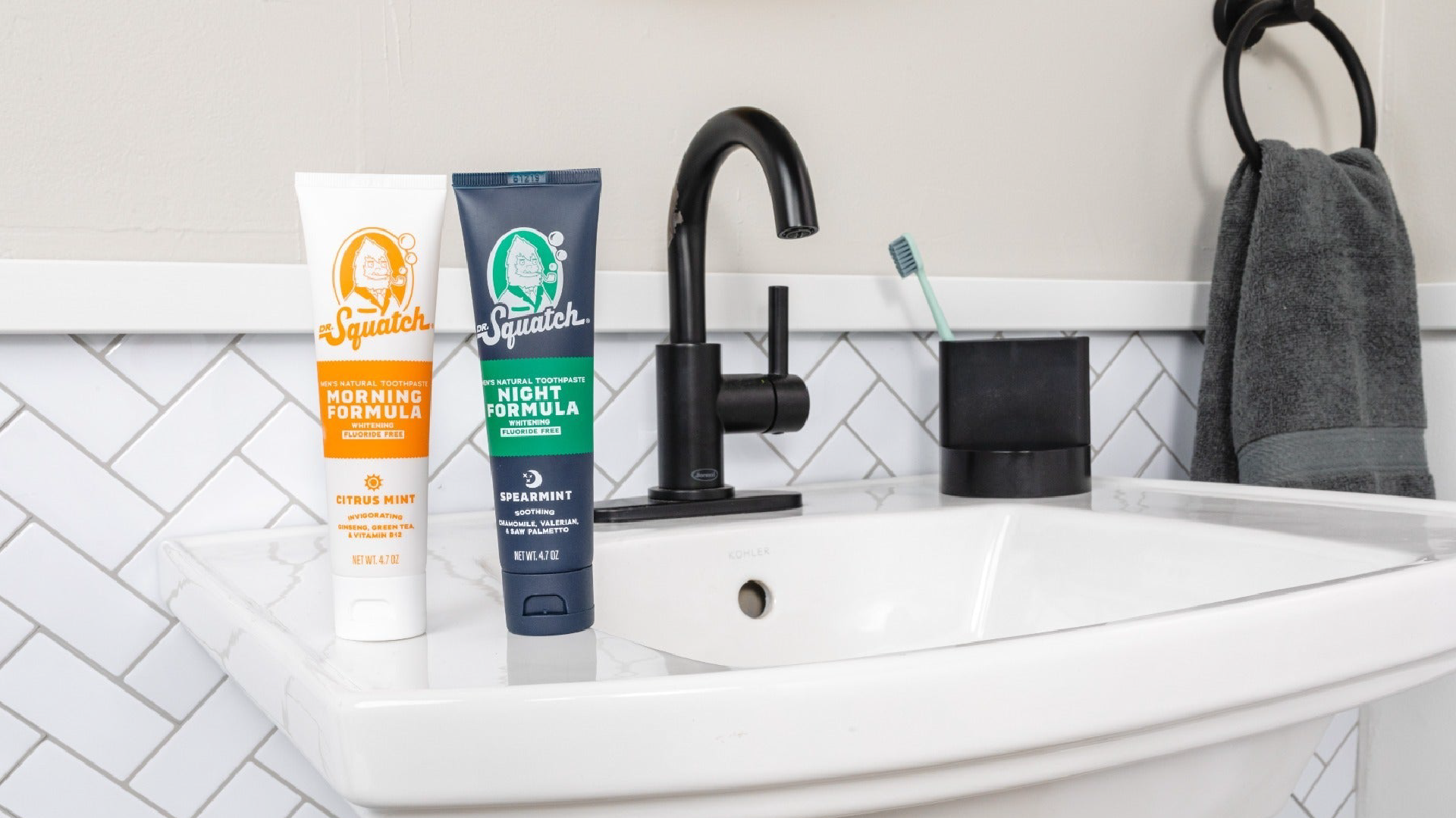
Dr. Squatch’s packaging originally started as a quick-to-produce system built around a single SKU: the soap bricc. But as the brand expanded, the farmers-market-style design approach quickly began to show small inconsistencies across the growing lineup. The packaging system needed a communications overhaul to give consumers a clearer reason to choose Dr. Squatch over the crowded competition on the shelf.
I elevated hero ingredients like pine tar, moonflower oil, and ground vanilla vine to better highlight what made each bar unique. To improve navigation, I introduced a grit-level system tied to each bar’s exfoliants, which created a natural wayfinding tool for men shopping by skin type. I introduced a hand-drawn icon system for every scent, giving each bar its own story and collectability, as if Dr. Squatch himself doodled them. And to finish the brand story, a doctor's note on the back explains how to use the product. Right from the desk of the Good Squatch himself.
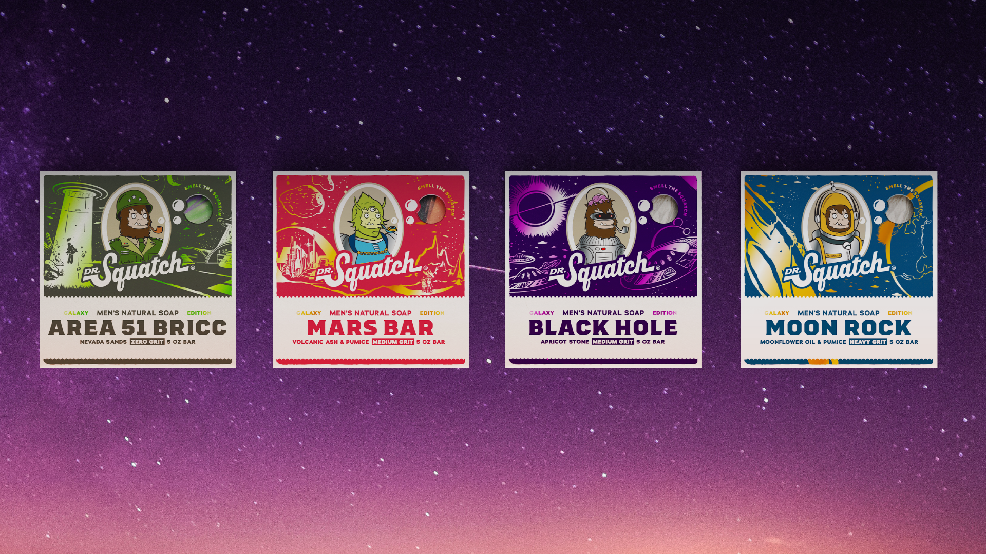
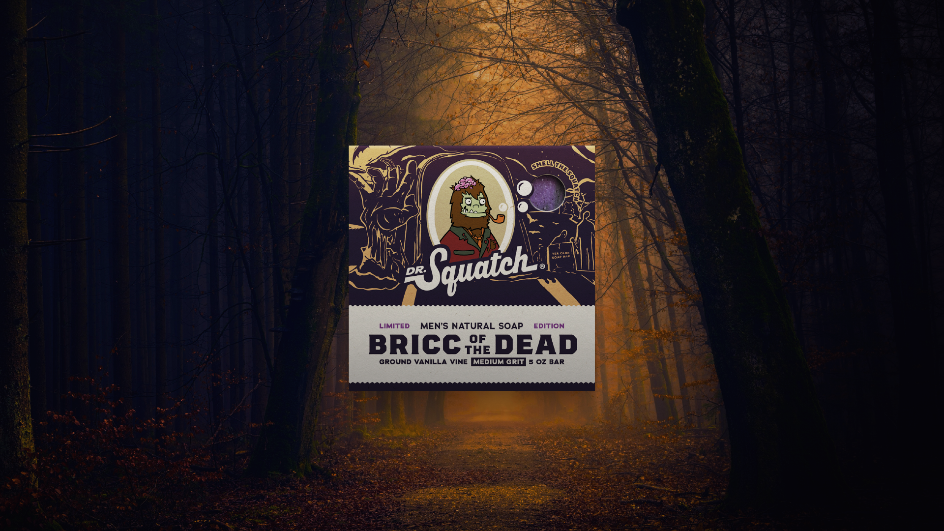
The brand had developed a cult-like following of customers who collected their limited-edition briccs. But outside of the scent names, there wasn’t much visually separating them from the core lineup.
To elevate the collectability of these drops, I inverted the color system so the scent-focused band became white, giving the bars a more premium feel while still keeping the Squatch vibe. I also replaced the woodgrain backgrounds with woodcut-inspired illustrations, allowing each scent to tell its own story.
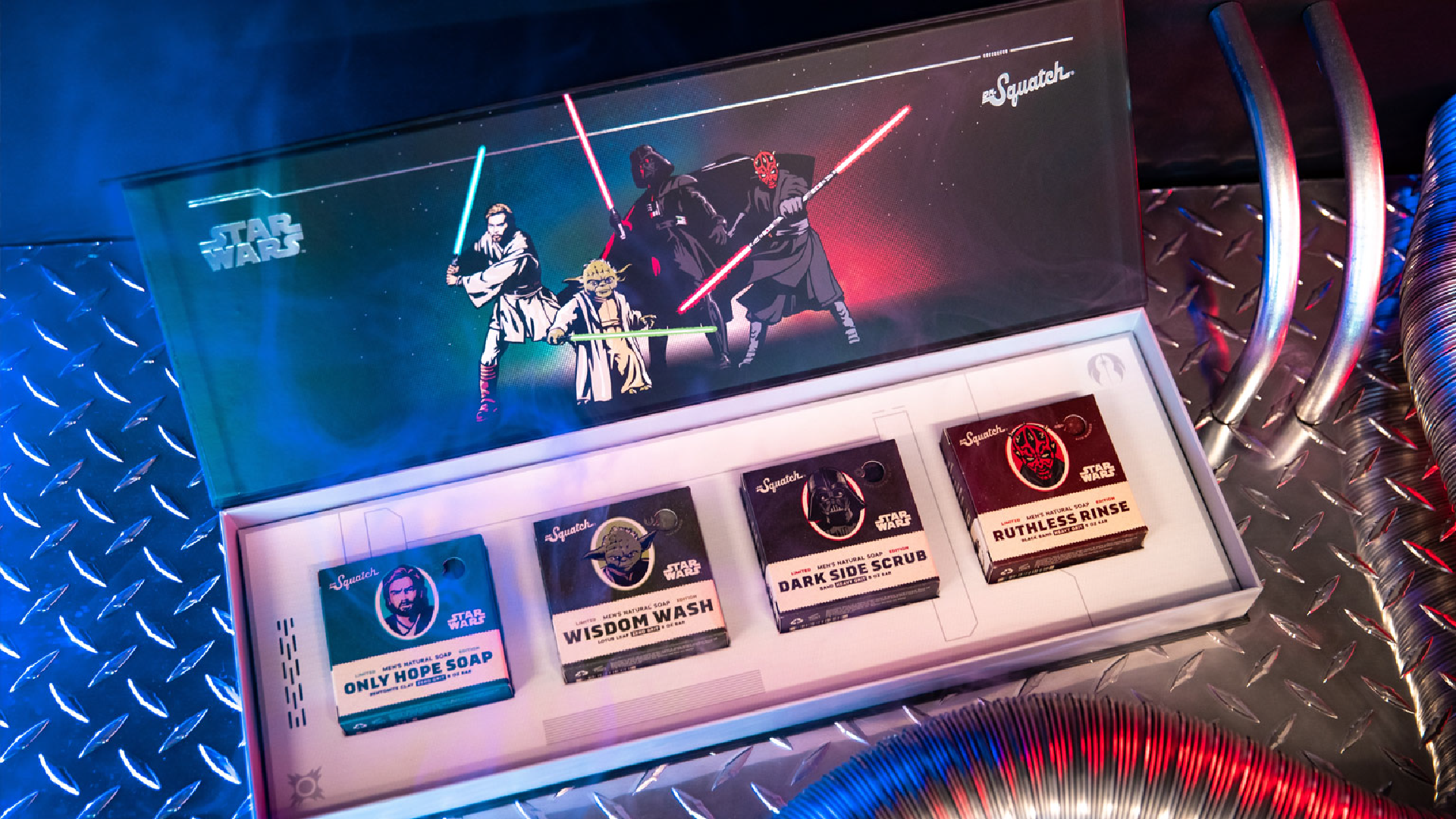
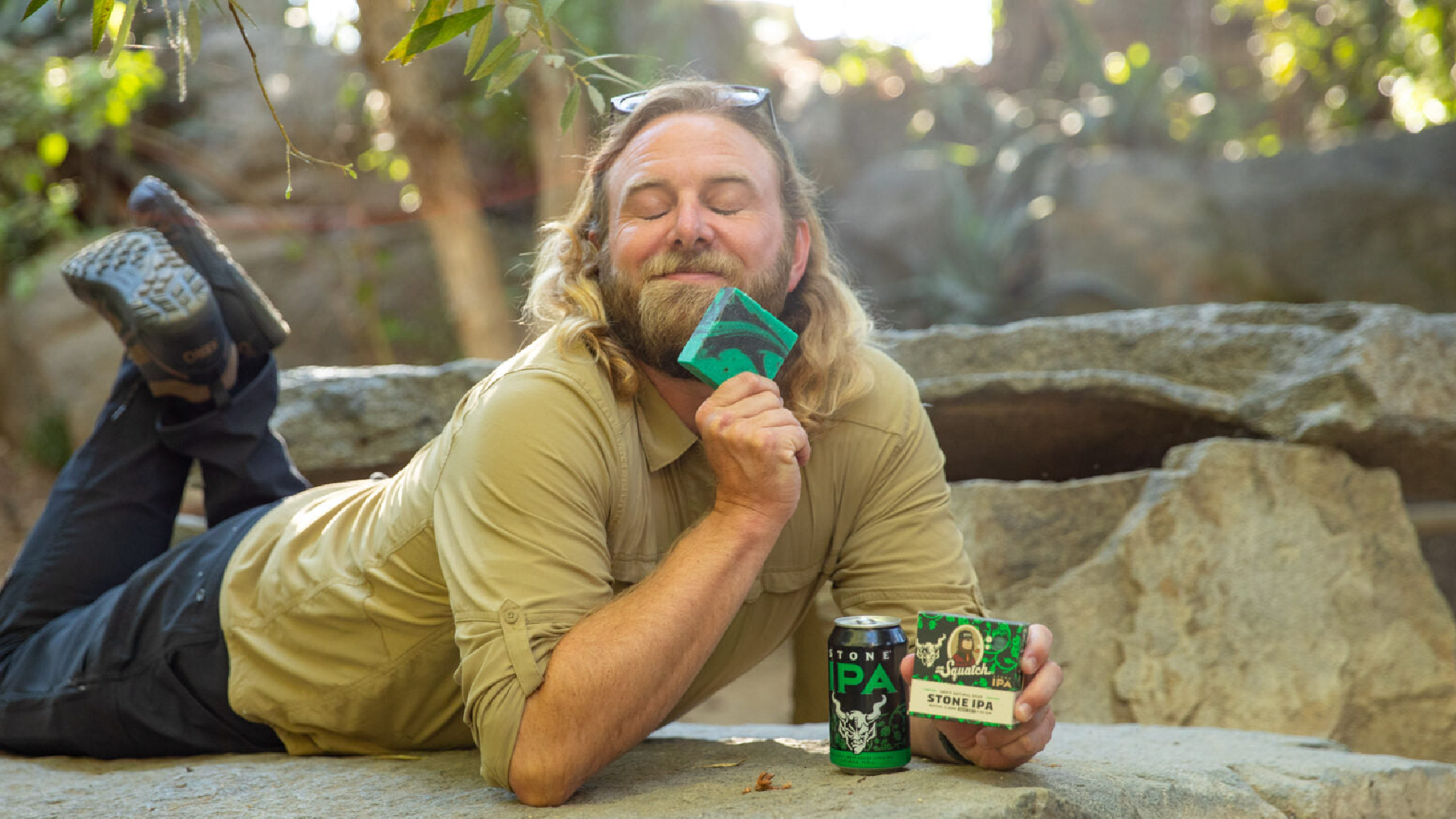
Dr. Squatch expanded into collaborations with franchises like DC Comics, Stone Brewing, Halo, and Star Wars, and the system helped push the collectability even further—while also introducing Dr. Squatch to a broader audience.


From refining the logo and packaging hierarchy to introducing grit-level navigation, ingredient-forward communication, and collectible hand-drawn storytelling, Dr. Squatch's rebrand gave consumers clearer reasons to choose the brand and keep the box afterwards.
Similar Projects


